Nora York Music
I was privileged to work with Nora York, making graphic promotional materials and projection videos for several of her performances, from 2012 until her death in 2016. Below are selections from some of those projects as well as designs from posthumous music releases and celebrations of her life.
Swoon
Design for cards placed on the tables at Joe’s Pub for the album release concert of SWOON in 2019.
The client wanted 5x7 cards that served as both a program for the evening’s performance and a promotion for the album. I utilized the bird from the album cover but removed the blue landscape background to make the design more clear in the dim light of Joe’s Pub, and incorporated that blue in the graphic and text elements instead.

Memorial Program
Design for a trifold program for the 2017 memorial celebration of the life of Nora York.
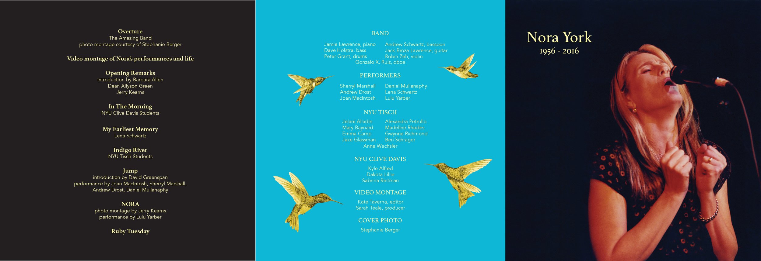
Exterior of trifold
Due to the nature of the project, the client gave me very little guidance on the design of this project outside of the information that it needed to include. I suggested formatting it so that the CD (below) that he wished to give to the attendees could be folded into the design. The blue color is a blue that York used on a previous album that referenced the same blue that her artist husband, Jerry Kearns, uses in many of his paintings. The hummingbirds are also elements from Kearns’ art that he has long used to symbolize Nora.
Interior of trifold
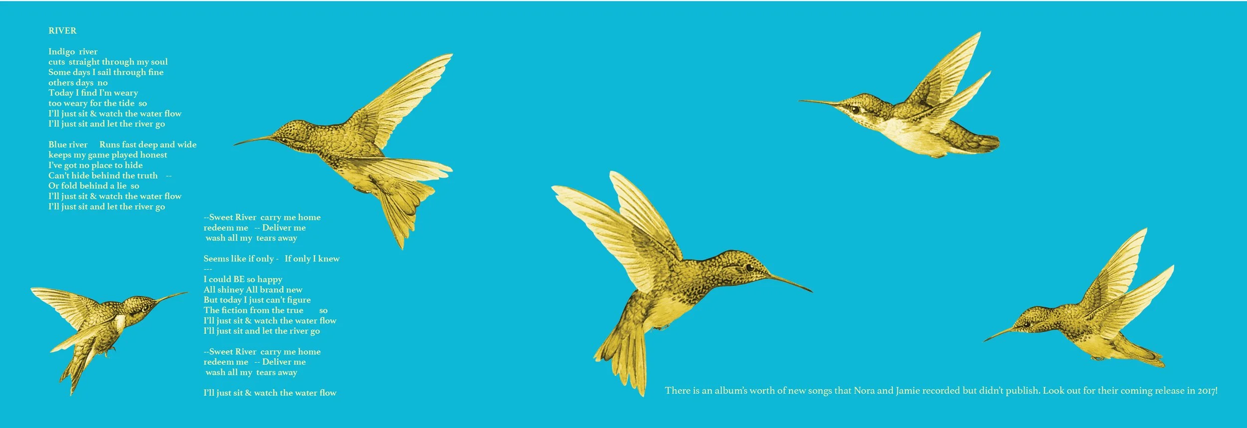
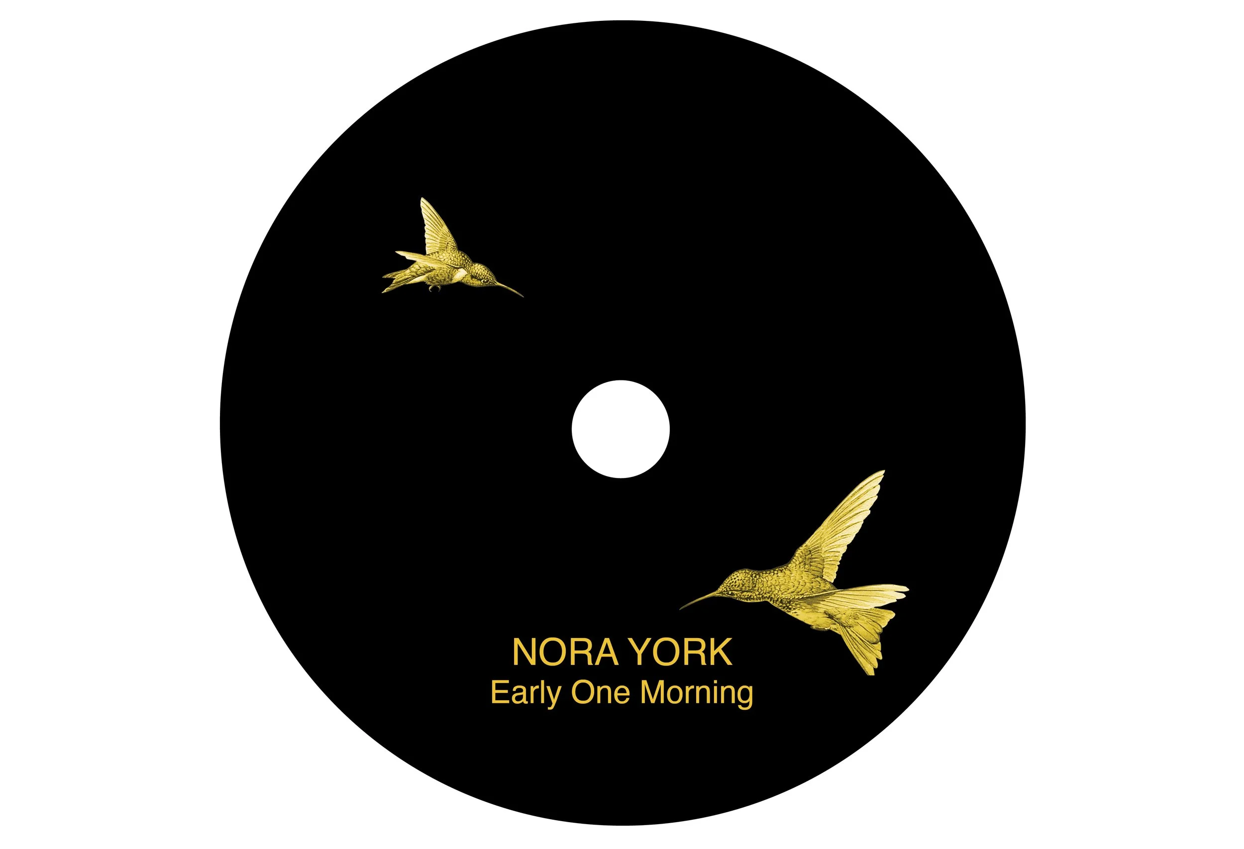
Early One Morning
Album cover design for 2017 release. The cover is a simple card stock sleeve.
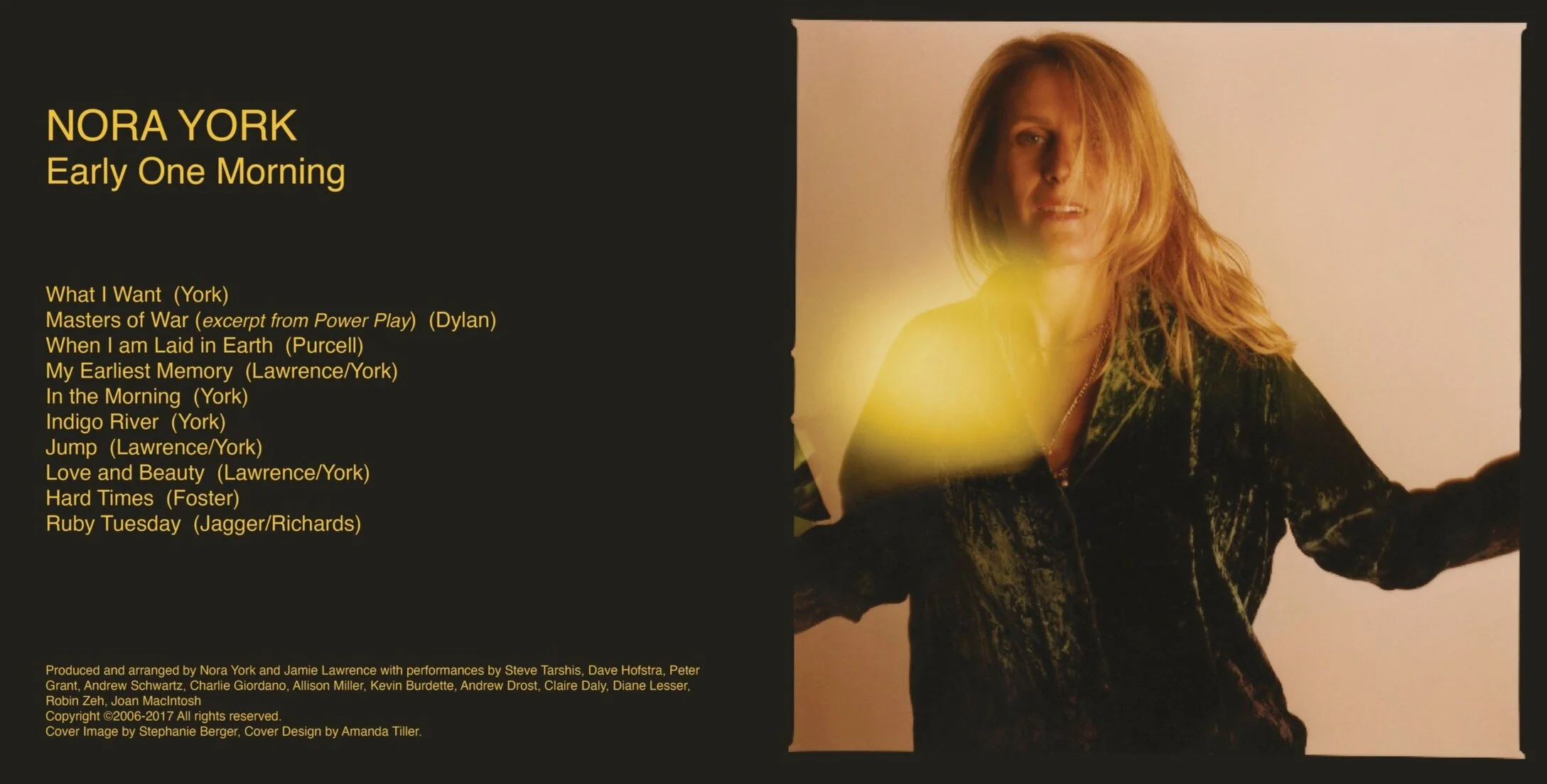
This CD was produced in conjunction with York’s memorial celebration. The client chose the cover image and requested I design the artwork around it. I chose to include the border from the original C-Print because it, along with the lens flare, suggested a window frame that worked with the album title. I continued the color from the border onto the back cover and disc, and incorporated the hummingbirds from the memorial program.
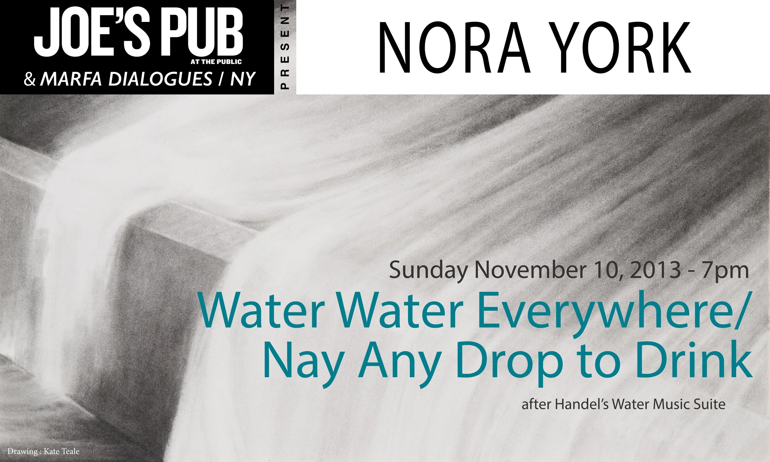
Water Water everywhere/Nay Any Drop to Drink
Promotional graphic for York’s project Water Water Everywhere/Nay Any Drop to Drink, part of the 2013 Marfa Dialogues: Connecting Art & Climate.
The client requested a graphic that could function both as a digital or print show card. She wished to use this graphite drawing by an artist friend. I stuck with the overall monochrome theme so as not to overshadow the delicacy of the image. The only color is a subtle blue to highlight the show’s title.