NYPOP Traveling Exhibition Program
UMass Amherst’s New York Professional Outreach Program (NYPOP) partnered with Western Michigan University’s Richmond Center for the Arts to produce a series of traveling art exhibitions.
Below are catalog and show card designs for three of those exhibitions.
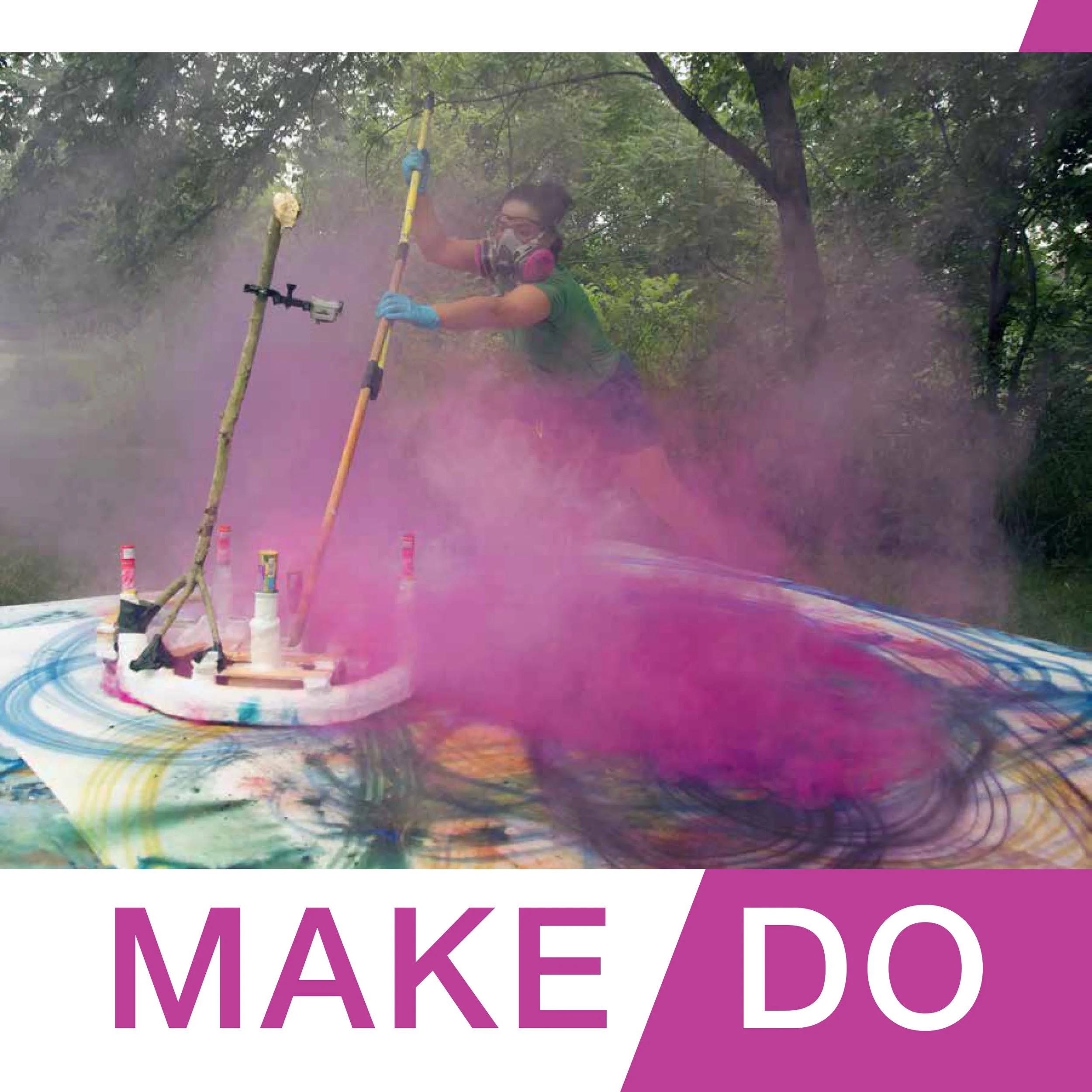
Make/Do
2014 EXHIBITION
The client requested a clean design with bright color that reflected the vibrant pieces in the exhibition.
Inspired by the magenta cloud of pigment from one of the images and the backslash in the title, I created a simple card and catalog design that worked in concert with the show’s images without pulling focus.

Nature Loves Courage
2015 EXHIBITION
The client requested a design that worked both with the show images and also reflected the visual aesthetics of the organization that curated the exhibition - the Wassaic Project.
Bold color and blocky text reflect WP’s visual style, and I utilized different blending modes to overlay the color elements over the images to reference a psychedelic origins of the show’s title.
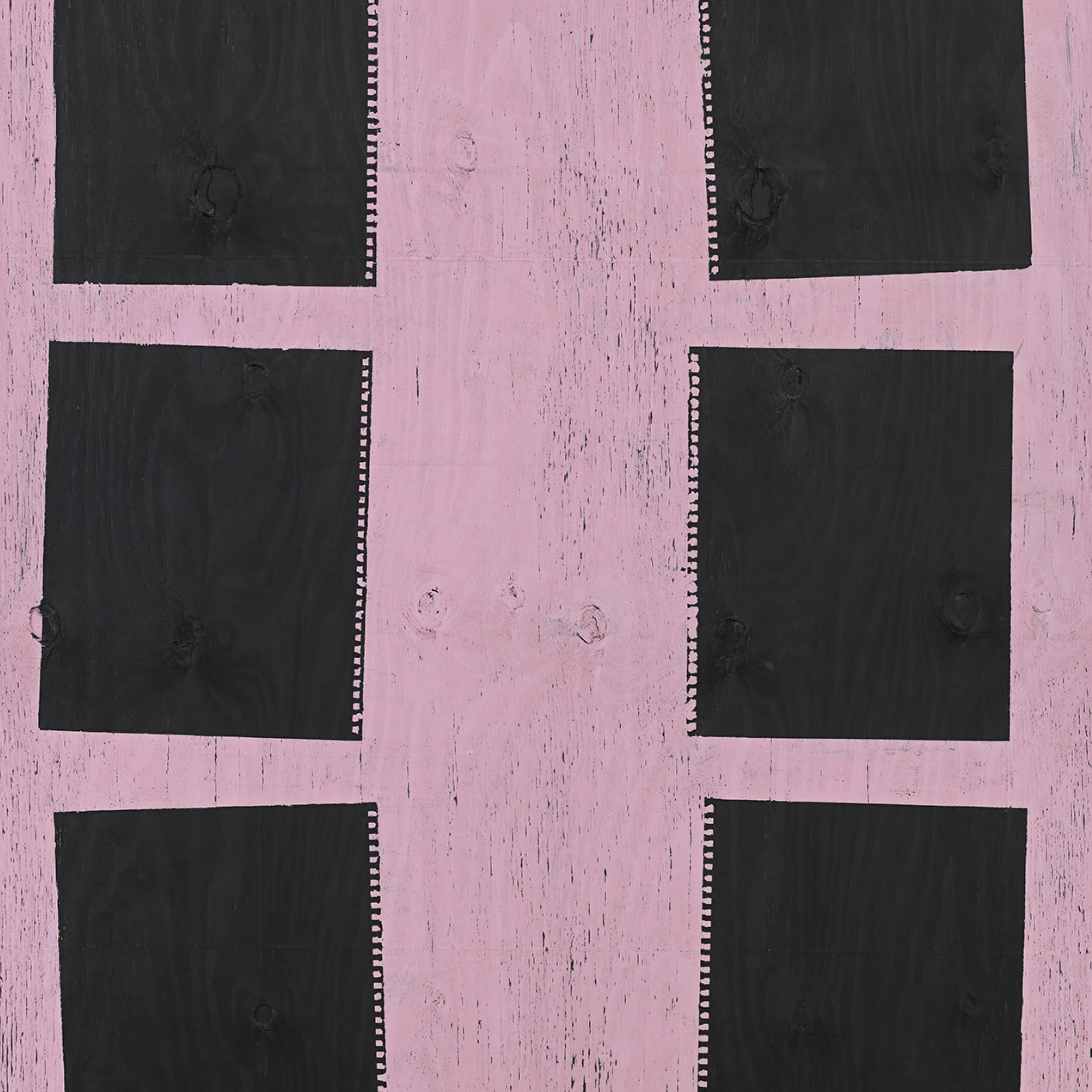
Plain Site
2016 EXHIBITION
Plain Site was a challenge because the clients were split on their design visions. The curator wanted the simplest design possible, while the gallery wanted something that would appeal more to their university audience.
A compromise was struck in keeping the catalog clean and simple, and incorporating color clocks on the reverse of the show card.